Congratulations! You’ve launched your Google Ads campaign. Your meticulously crafted ads are out there in the digital world, battling for user clicks. But the war isn’t won yet, soldier. Those clicks are merely the first step on the path to conversion. The real battlefield lies on your landing page – the digital real estate where you turn curious clicks into loyal customers or enthusiastic leads.
So, how do you transform your landing page from a barren click graveyard into a conversion-generating oasis? Fear not, fellow advertiser, for this blog post is your secret weapon. We’ll delve into the intricacies of Google Ads landing pages, equipping you with the knowledge to craft a user experience that compels action and maximizes your campaign’s return on investment (ROI).
Relevance is King: Aligning Your Landing Page with Your Ad
Imagine this: you click on an ad promising a free consultation with a financial advisor. But upon landing, you’re bombarded with generic investment products. Disappointed and confused, you hit the back button. This, my friends, is the cardinal sin of landing pages – a lack of relevance.
The golden rule for Google Ads landing pages is simple: mirror the message of your ad. Let’s say your ad promotes a discount on running shoes. Your landing page shouldn’t showcase the latest fashion accessories. Instead, it should showcase your running shoe collection, highlight the discount, and provide clear calls to action for purchase.
This seamless transition between ad and landing page builds trust and user satisfaction. When users see their search intent reflected on the landing page, they’re more likely to engage and convert.

Here are some tips to ensure perfect ad-to-landing page alignment:
- Utilise the same keywords and messaging: Don’t reinvent the wheel. Replicate the core keywords and benefit-driven language from your ad onto the landing page.
- Maintain a consistent visual identity: Colors, fonts, and overall design should reflect your brand and match the visual elements used in your ad.
- Target specific landing pages to specific ad groups: If you have multiple ad groups targeting different products or services, create dedicated landing pages for each, ensuring a hyper-focused user experience.
Clarity is King’s Advisor: Guiding Users with a Focused Message
Your landing page shouldn’t be a labyrinth of information. It should be a laser-focused path leading users towards a single, well-defined goal. Whether it’s a purchase, a free trial, or a newsletter signup, make your objective crystal clear from the outset.
Here’s how to ensure your landing page message is clear and concise:
- Craft a compelling headline: The headline is your landing page’s first impression. Make it bold, benefit-oriented, and directly tied to your ad’s message.
- Focus on the benefits, not the features: Don’t just list features of your product or service. Explain how those features solve user problems and improve their lives.
- Use concise and persuasive copy: Avoid jargon and technical terms. Write in a clear, conversational style that speaks directly to your target audience.
- Eliminate distractions: Minimize navigation options and extraneous information that might divert users from your conversion goal.
Remember, your landing page isn’t a novel. It’s a persuasive pitch, delivered concisely and with laser focus.
The Call to Action: Your Conversion Lifeline
Imagine a captivating movie trailer that ends without revealing the movie’s title or release date. Frustrating, right? That’s what a landing page without a clear call to action (CTA) feels like.
Your CTA is the bridge between user interest and conversion. It tells visitors exactly what you want them to do next, whether it’s “Buy Now,” “Download Now,” or “Sign Up Today.”
Here are some tips for crafting a compelling CTA:
- Use strong verbs: Opt for action-oriented verbs like “buy,” “download,” or “subscribe” to evoke a sense of urgency.
- Make your CTA button prominent: Don’t hide your CTA button! Use contrasting colors and clear design elements to make it the focal point of your landing page.
- Craft multiple CTAs: Consider using CTAs throughout your landing page to cater to users at different stages of the decision-making process.
- A/B test different CTAs: Don’t be afraid to experiment with different CTA wording, button styles, and placement to see what resonates best with your audience.
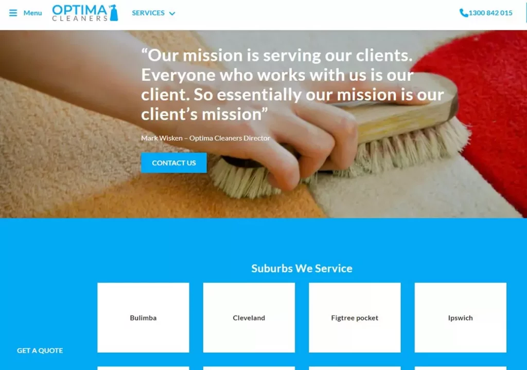
By crafting clear and compelling CTAs, you guide users towards conversion and increase the overall effectiveness of your Google Ads campaign. Recent case study prepared by Australian marketing company Pitch Black, showed that optimising this landing page: https://optimacleaners.com.au/carpet-and-rug-cleaning/brisbane/ they’ve promoting for their client Optima Cleaners, by just changing the CTA to more aggresive, resulted in 11% increase in conversion rate!

Landing Page Optimisation: A Continuous Journey
The journey doesn’t end after launching your landing page. In
the ever-evolving world of digital marketing, optimization is key. Here’s how to ensure your landing page remains a conversion champion:
- Embrace A/B testing: A/B testing allows you to compare different versions of your landing page elements, such as headlines, CTAs, or page layouts. This data-driven approach helps you identify what resonates best with your audience and continuously optimize for conversions.
- Utilize heatmaps and session recordings: Heatmaps visually represent user interactions on your page, revealing areas of high and low engagement. Session recordings allow you to observe real user behavior, providing valuable insights into how users navigate your landing page. Leverage these tools to identify and address any user experience roadblocks that might be hindering conversions.
- Track and analyze data: Monitor key metrics like conversion rate, bounce rate, and time on page. Analyze this data to understand user behavior and identify areas for improvement. Tools like Google Analytics provide valuable insights to help you refine your landing page for maximum effectiveness.
- Stay updated on Google Ads best practices: Google Ads is constantly evolving. Regularly check Google’s support resources and industry blogs to stay informed about the latest best practices for landing page design and optimization.
By continuously testing, analyzing, and iterating, you can ensure your landing page remains a well-oiled conversion machine.
Landing the Perfect Conversion
Crafting a high-converting landing page for your Google Ads campaign requires strategic planning, focused messaging, and a user-centric approach. By aligning your landing page with your ads, prioritizing clarity, and incorporating clear CTAs, you’ll guide users towards conversion and unlock the true potential of your advertising efforts. Remember, landing page optimization is an ongoing process. Embrace experimentation, utilize data to your advantage, and stay updated on industry trends. With dedication and these valuable insights, you’ll transform your landing page from a click graveyard into a conversion paradise.
